The OneForm brand, in one place.
Logos, colours, type and the words we use, for anyone writing about OneForm, linking to it or designing for it.
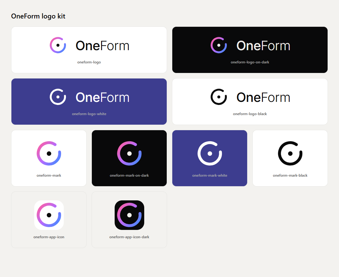
An open ensō around one dot.
A single brush-stroke ring in the brand gradient, open at the top right, around one dot: one form. The wordmark sets “One” in Inter Medium and “Form” in Inter Light.
Logo
The mark and the wordmark together. Use this wherever there's room.
 LogoLight pages, documents
 Logo on darkDark pages, most social posts
 Logo, whiteOne colour on dark or photos
 Logo, blackOne colour: stamps, embossing












Mark
The ensō alone, for avatars, corners and watermarks.
 MarkAvatars and small spaces on light
 Mark on darkCorners and watermarks on dark
 Mark, whiteOne colour on dark
 Mark, blackOne colour on light










App icon
The mark on a rounded tile, for home screens and profile pictures.
 App iconHome screens, profile pictures
 App icon, darkProfile pictures on social





Also in the kit


Room to breathe.
Give the logo space and keep it legible. These are the minimums; more is usually better.
20 px16 pxPlease don't.
Use the files as they are. If none of them fits, use the white or black version rather than changing one.
Don't stretch or squash it
Don't recolour the gradient
Don't rotate it
Don't add shadows or effects
Don't outline it
- OneForm
Don't retype the wordmark
Don't place it on a busy background
Don't use a version without enough contrast
A near-black stage, one gradient.
Warm neutrals do most of the work. The gradient is the accent, used once per design.
Brand
The three gradient stops. One gradient moment per design: a key word, the main button or the mark.
- Pink
--color-pinkGradient start- HEX
- RGB
- HSL
- OKLCH
On stage7.02:1AAAOn white2.83:1Fail - Violet
--color-violetGradient middle- HEX
- RGB
- HSL
- OKLCH
On stage6.12:1AAOn white3.24:1AA large - Blue
--color-blueGradient end- HEX
- RGB
- HSL
- OKLCH
On stage6.00:1AAOn white3.31:1AA large
Dark (website, social)
The default for marketing. Text is a warm off-white, never pure white.
- Stage
--color-bgPage background- HEX
- RGB
- HSL
- OKLCH
On stage1.00:1FailOn white19.90:1AAA - Panel
--color-paperCards- HEX
- RGB
- HSL
- OKLCH
On stage1.05:1FailOn white18.89:1AAA - Raised
--color-washChips, raised surfaces- HEX
- RGB
- HSL
- OKLCH
On stage1.10:1FailOn white17.93:1AAA - Raised 2
--color-sumiRaised surfaces- HEX
- RGB
- HSL
- OKLCH
On stage1.20:1FailOn white16.50:1AAA - Hairline
--color-line1 px borders- HEX
- RGB
- HSL
- OKLCH
On stage1.20:1FailOn white16.49:1AAA - Hairline 2
--color-line-2Stronger borders- HEX
- RGB
- HSL
- OKLCH
On stage1.44:1FailOn white13.75:1AAA - Night indigo
--color-nightSky near the horizon- HEX
- RGB
- HSL
- OKLCH
On stage1.22:1FailOn white16.20:1AAA - Text
--color-inkHeadlines, main text- HEX
- RGB
- HSL
- OKLCH
On stage17.45:1AAAOn white1.14:1Fail - Text 2
--color-ink-2Subheads, body- HEX
- RGB
- HSL
- OKLCH
On stage12.37:1AAAOn white1.60:1Fail - Muted
--color-mutedSupporting text- HEX
- RGB
- HSL
- OKLCH
On stage6.46:1AAOn white3.07:1AA large - Faint
--color-faintFine print- HEX
- RGB
- HSL
- OKLCH
On stage5.31:1AAOn white3.74:1AA large
Light (app, reports)
The app and the PDF reports, for product screenshots and light variants.
- Paper
--color-light-paperPage- HEX
- RGB
- HSL
- OKLCH
On stage19.90:1AAAOn white1.00:1Fail - Wash
--color-light-washBackgrounds- HEX
- RGB
- HSL
- OKLCH
On stage19.04:1AAAOn white1.04:1Fail - Ink
--color-light-inkText, the logo's dot- HEX
- RGB
- HSL
- OKLCH
On stage1.00:1FailOn white19.79:1AAA - Ink 2
--color-light-ink-2Secondary text- HEX
- RGB
- HSL
- OKLCH
On stage1.77:1FailOn white11.20:1AAA - Muted
--color-light-mutedSupporting text- HEX
- RGB
- HSL
- OKLCH
On stage2.97:1FailOn white6.68:1AA - Line
--color-light-lineBorders- HEX
- RGB
- HSL
- OKLCH
On stage16.97:1AAAOn white1.17:1Fail - Line 2
--color-light-line-2Stronger borders- HEX
- RGB
- HSL
- OKLCH
On stage15.33:1AAAOn white1.29:1Fail - App violet
--color-light-accentThe app's accent- HEX
- RGB
- HSL
- OKLCH
On stage6.04:1AAOn white3.29:1AA large
Contrast is the WCAG 2 ratio for text in that colour. AA needs 4.5:1 (3:1 for large text), AAA needs 7:1. Click a colour or a value to copy it.
The gradient
Pink at the top left to blue at the bottom right. Use it once per design: the key word of a headline, the main button, the mark or a thin line. Never on large backgrounds, icons or body text.
background: linear-gradient(100deg, #ff5fa2 0%, #b36bff 48%, #3d8bff 100%);Three free typefaces.
All three are on Google Fonts. Headlines are big and tight, in sentence case.
Headlines (SemiBold 600, −2%, line height 1.04) and body text (Regular 400, line height 1.6) on the website.
Google Fonts ↗The wordmark: “One” in Medium 500, “Form” in Light 300, tracking −2%. Use the logo file rather than retyping it.
Google Fonts ↗Small labels and chips: all caps, tracking +14%, about 11 px on the web.
Google Fonts ↗The type scale
Edit the sample to see your own words at every size the site uses.
- DisplayInter Tight 600 · 40 → 60 px · −2% · 1.04Forms in. Reports out.
- HeadingInter Tight 600 · 34 → 48 px · −2% · 1.04Forms in. Reports out.
- SubheadingInter Tight 600 · 26 → 32 px · −2%Forms in. Reports out.
- TitleInter Tight 500 · 16 pxForms in. Reports out.
- BodyInter Tight 400 · 15.5 → 17 px · 1.6Forms in. Reports out.
- SmallInter Tight 400 · 13.5 pxForms in. Reports out.
- LabelJetBrains Mono 400 · 11 px · caps · +14%Forms in. Reports out.
Thin lines, quiet tiles.
White line icons with a 1.6 px stroke on neutral dark tiles. They draw themselves in once, then move a little. Never in the gradient.
Calm, precise, plain.
We write like a sharp senior accountant: short sentences, concrete words, and the firm always in control.
- Calm, confident, precise
Write like a sharp senior accountant, not a startup chasing attention.
- Short sentences, plain words
“Forms in. Reports out.” is the model: two beats, nothing extra.
- Concrete over abstract
Name the thing the reader gets: a memo, a booking, a paid report.
- The firm stays in control
The AI drafts and the firm approves. Never suggest it replaces the accountant or advisor.
- Only what's true
No invented numbers, quotes, client logos or ratings. Voice forms are always labelled beta.
Headlines
Write: Every response becomes a report.
Not: Unlock AI-powered productivity for your practice!
Write: A planning memo for every client, drafted before you open your inbox.
Not: The revolutionary AI that 10x’s your firm.
Write: Review it. Approve it. Send it.
Not: Let the AI handle your clients for you.
Write: Know which lead to call first.
Not: Unleash next-gen lead intelligence 🚀
Write: A booking page that gets you paid before the call.
Not: A game-changing scheduling experience.
Ready to paste.
For articles, directories, event listings and partner pages. Please keep them factual; shorten them rather than adding claims.
- Tagline
Forms in. Reports out.
- Category line
Forms to automated reports
- One-liner· 33 words
OneForm is an AI form builder for accounting firms, financial advisors and professional practices. It turns every form response into a reviewed, client-ready report, with paid reports, booking and lead scoring built in.
- About 50 words· 51 words
OneForm is an AI form builder for accounting firms, financial advisors and professional practices. Describe a form in one sentence and OneFormAI builds it. Each response becomes a draft report, and the firm reviews, approves and sends it as a branded PDF. Paid reports, bookings and lead scoring are built in.
- About 100 words· 99 words
OneForm is an AI form builder for tax and accounting firms, financial advisors and professional-services firms. It turns every form response into a reviewed, client-ready report. A firm describes the form it needs in one sentence, or starts from a template such as a year-end planning questionnaire, and OneFormAI builds it. Clients answer a branded form on any device, or talk to it with voice forms (beta). Each response becomes an AI-drafted report that the firm reviews, edits and approves before it goes out as a branded PDF. Paid reports, booking pages, lead scoring and workflows are built in.
Writing the name
One word, capital O and capital F.
- Correct: OneForm
- Correct: OneFormAI (the form builder's AI)
- Incorrect: Oneform
- Incorrect: One Form
- Incorrect: ONEFORM
The product, as it is.
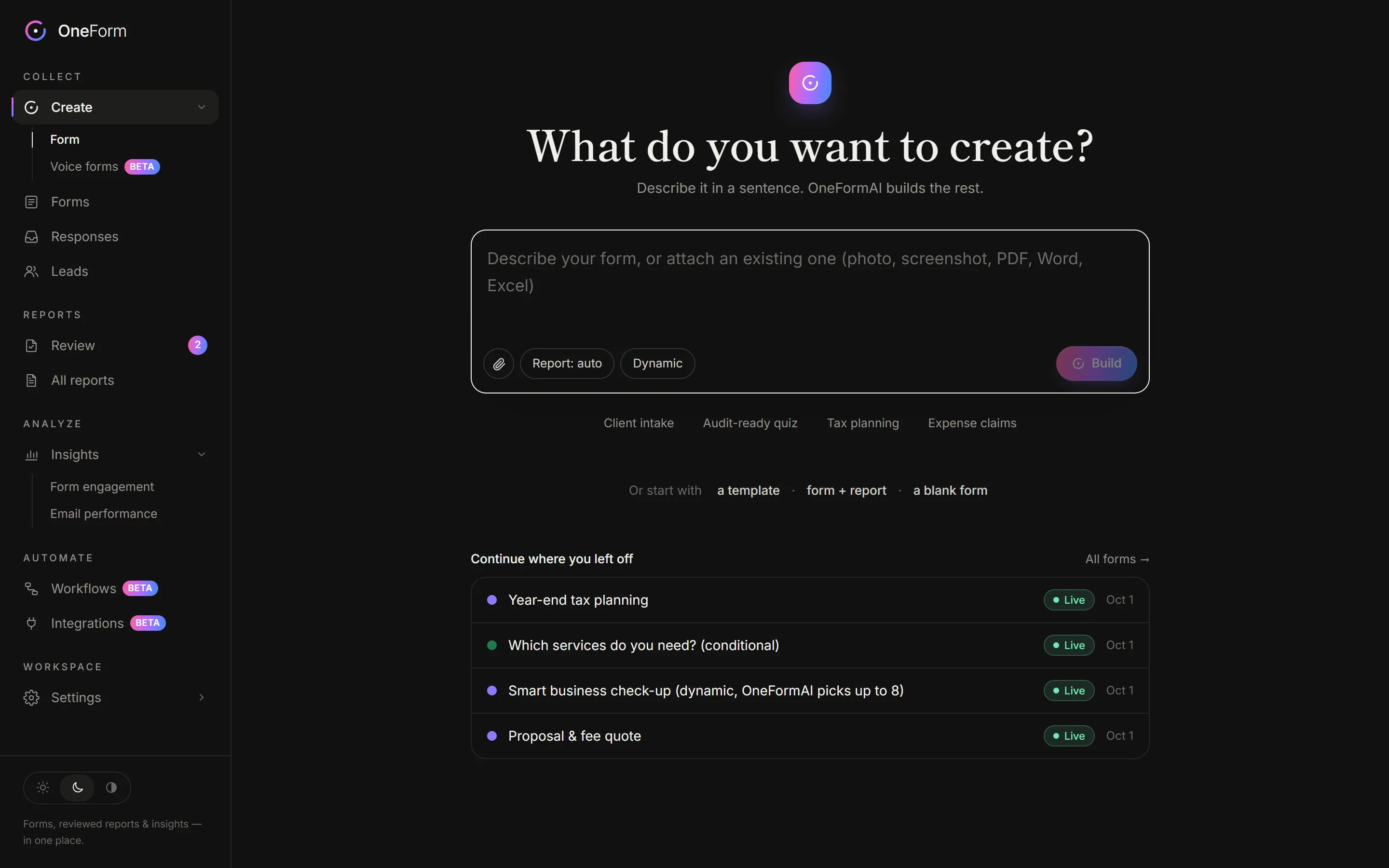
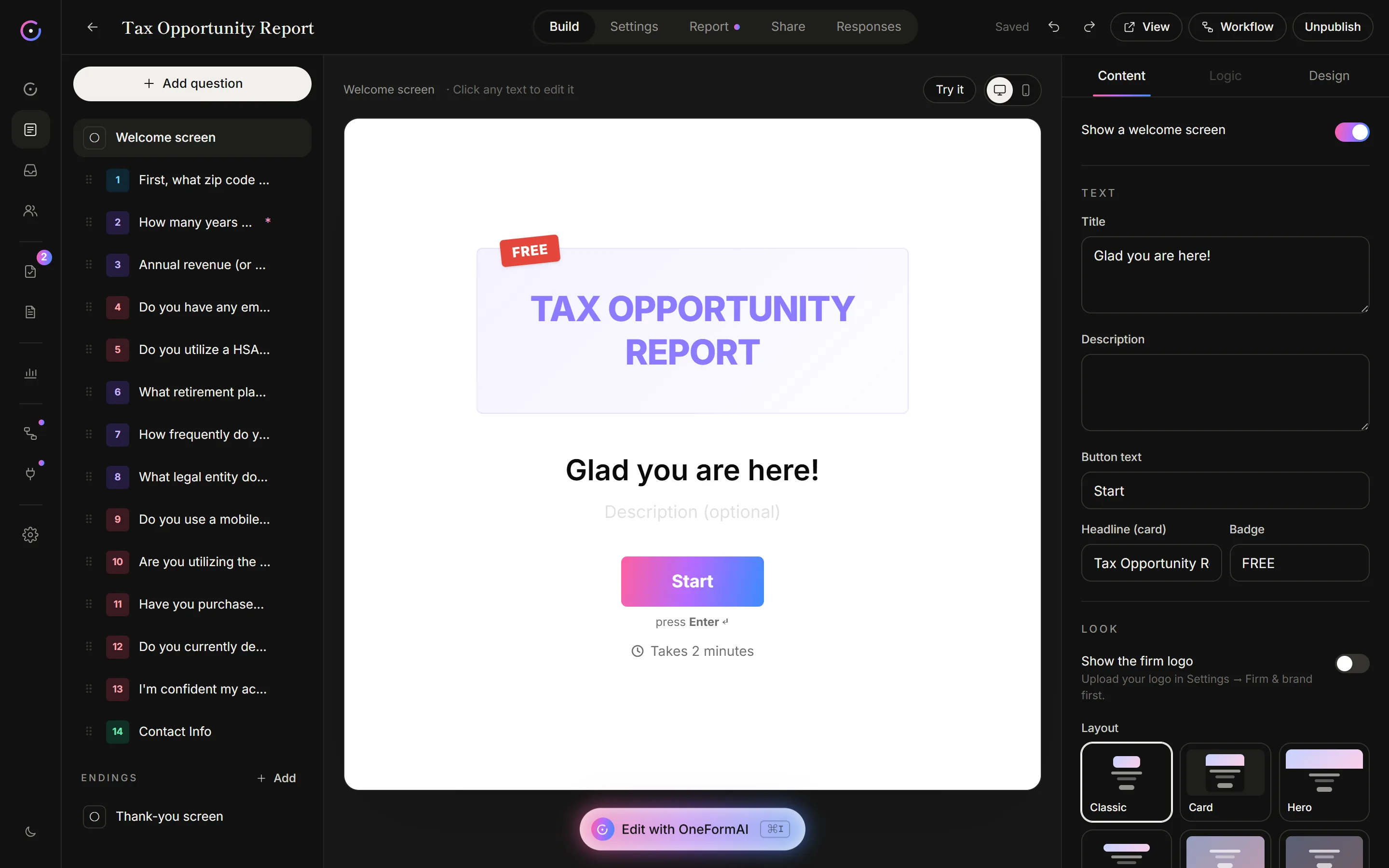
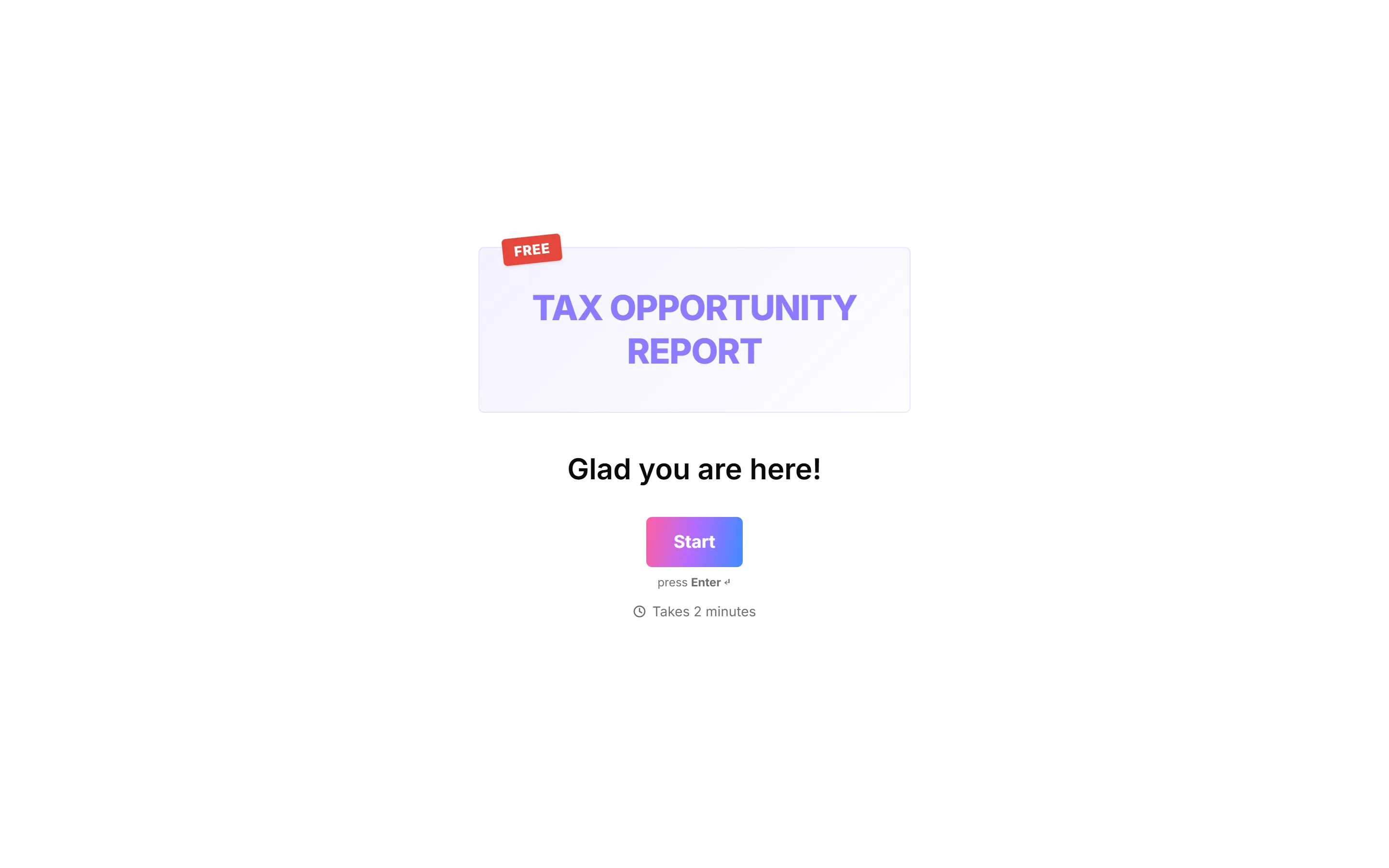
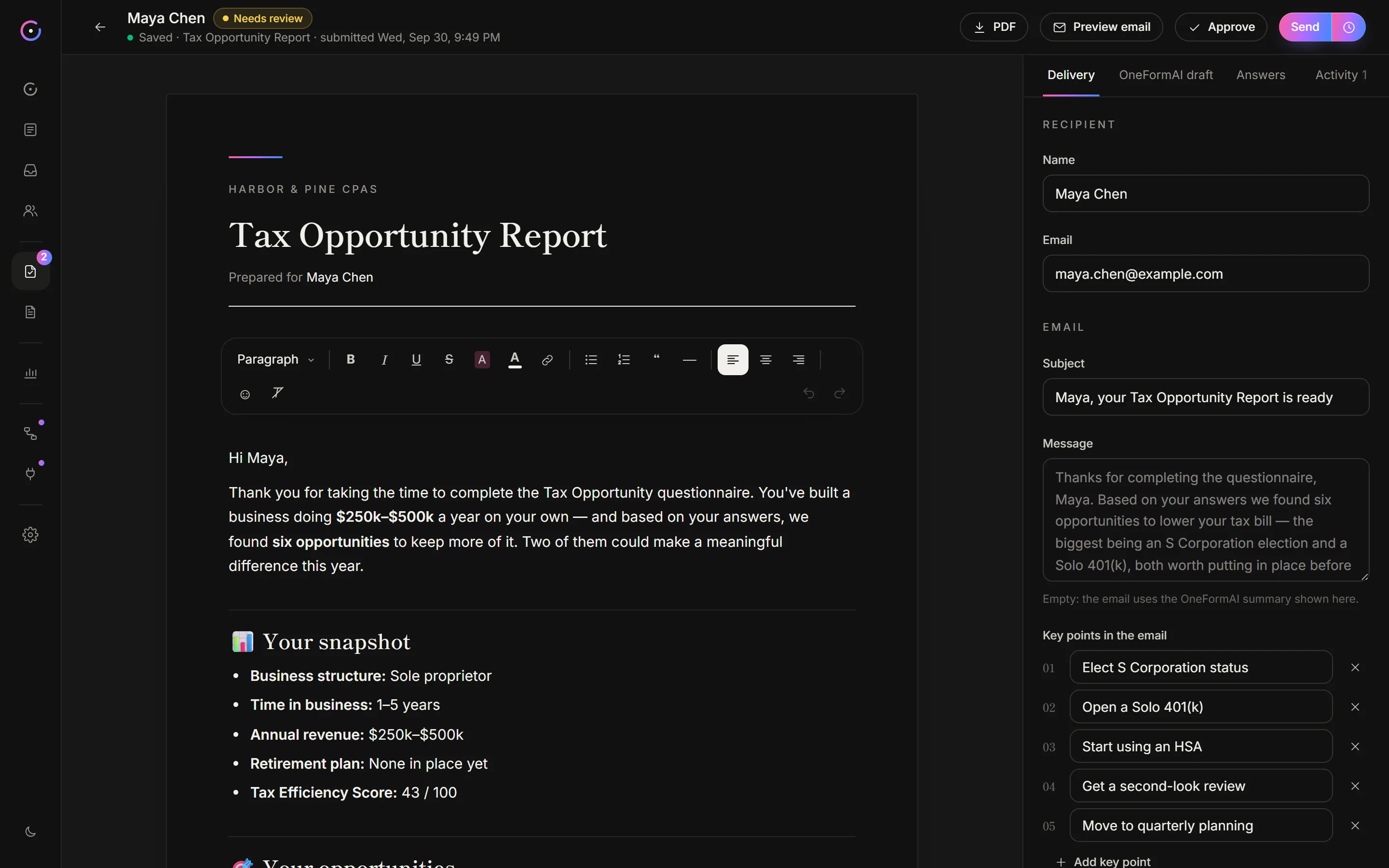
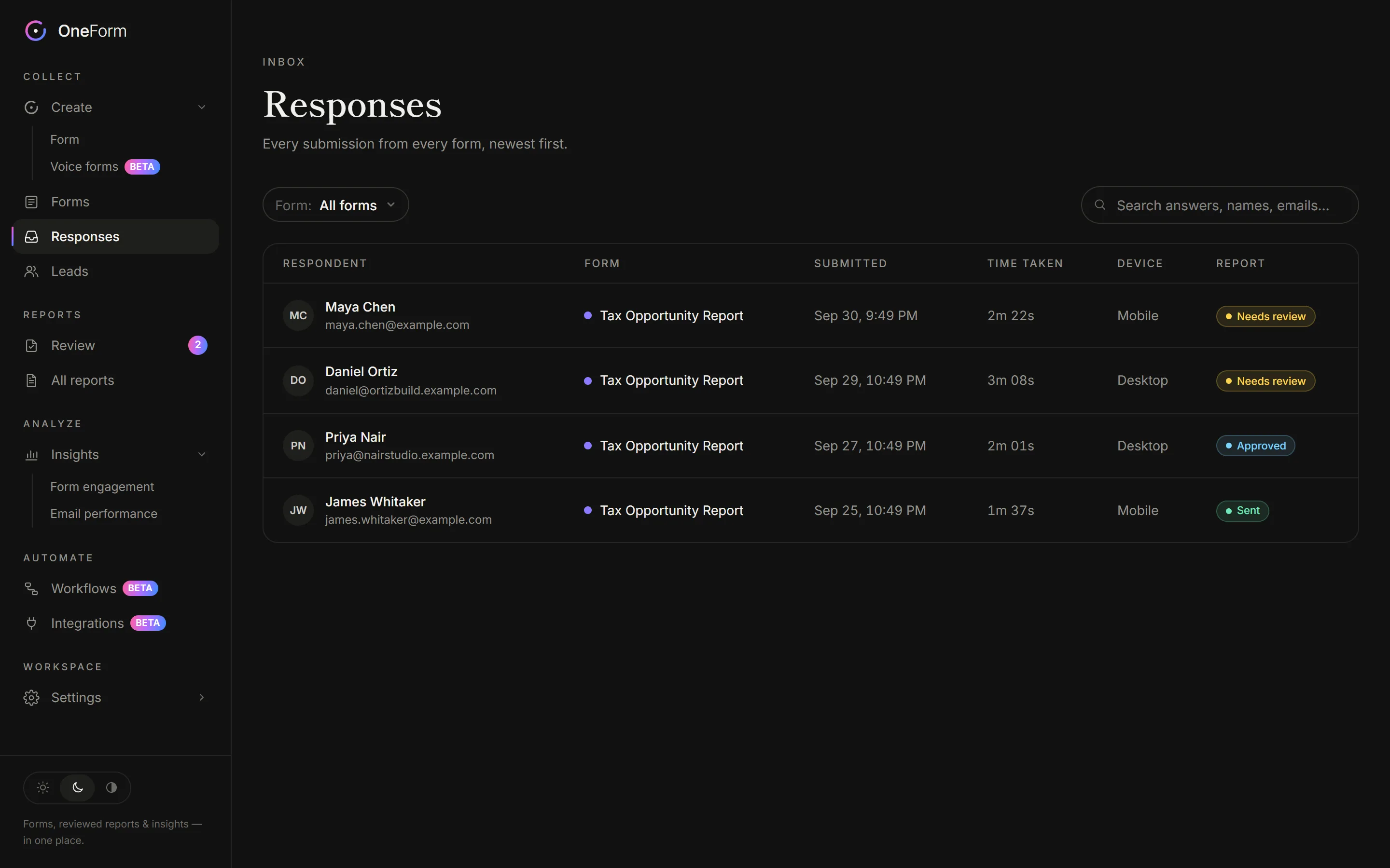
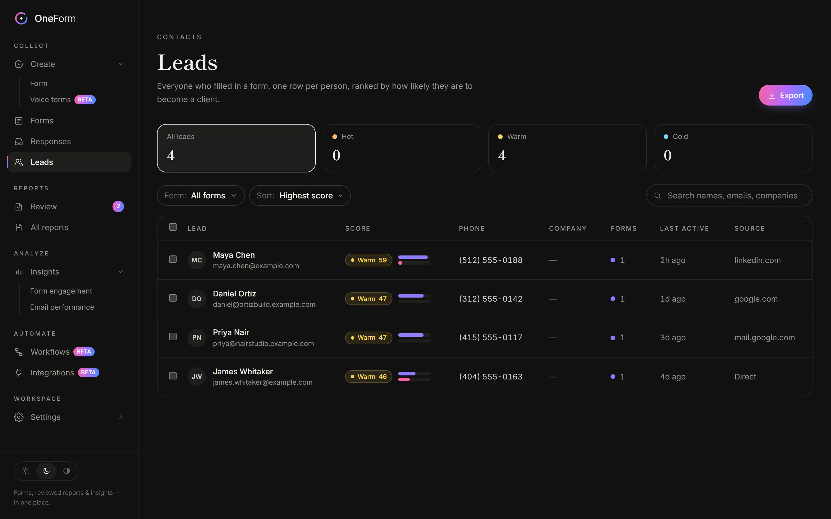
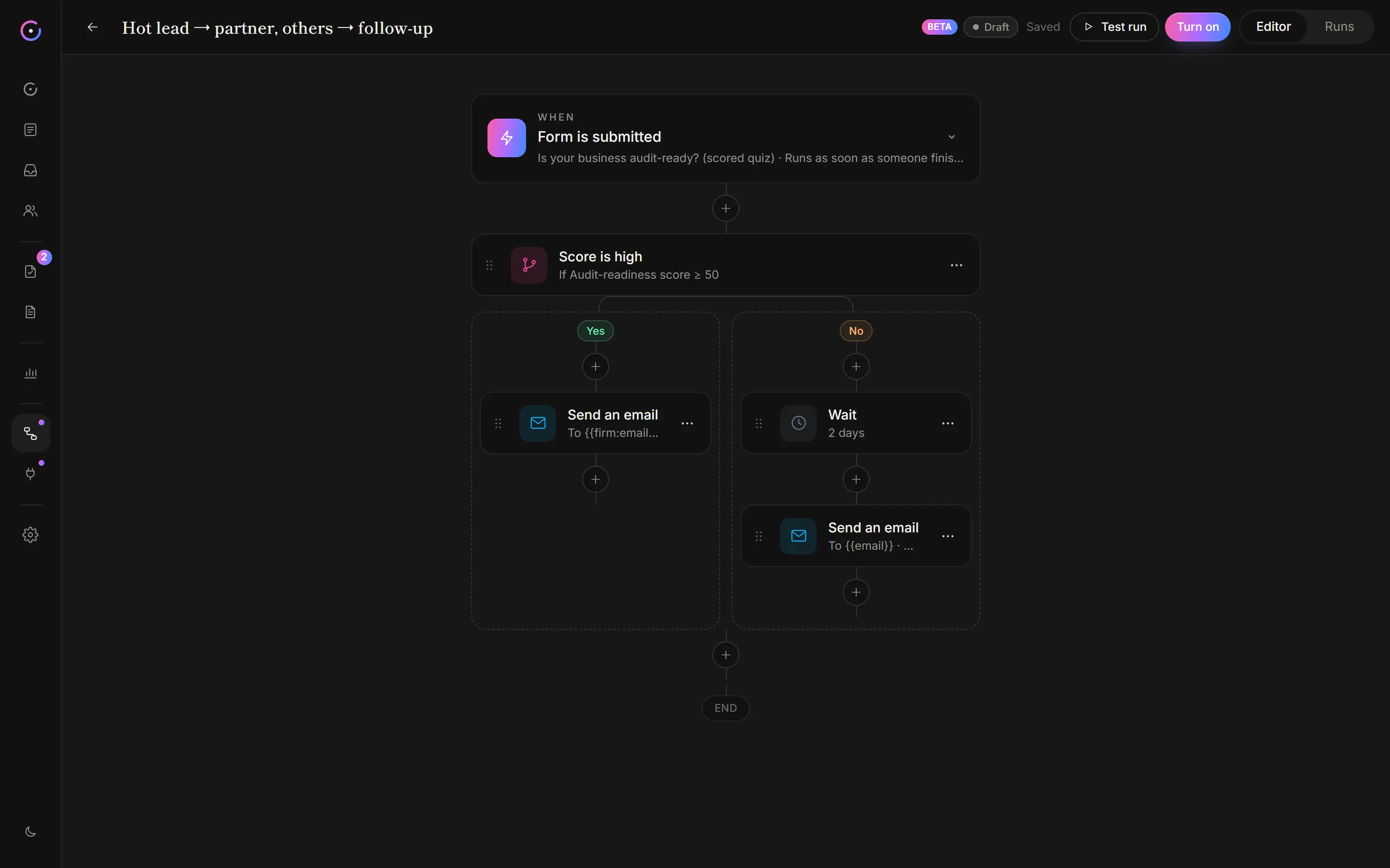
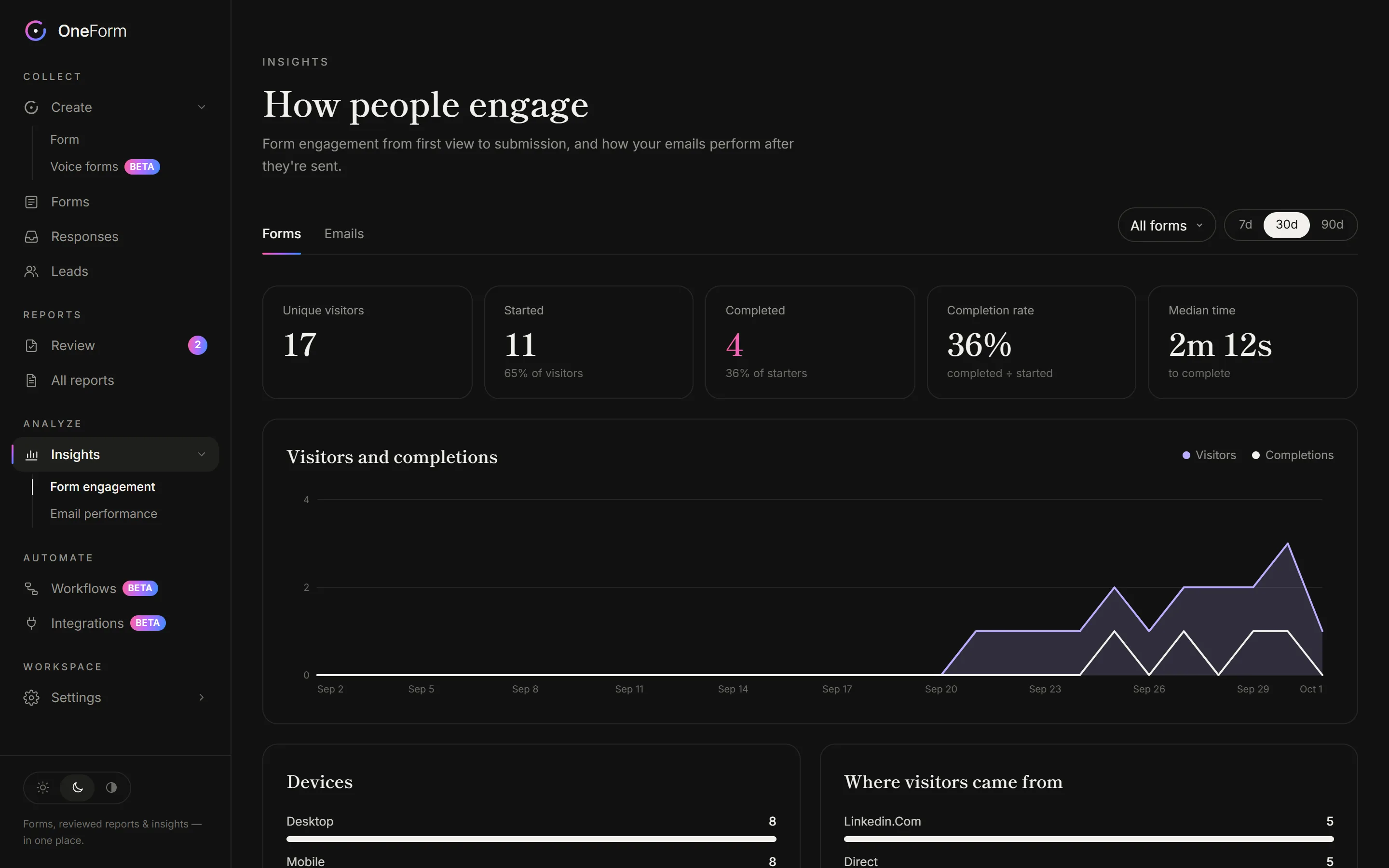
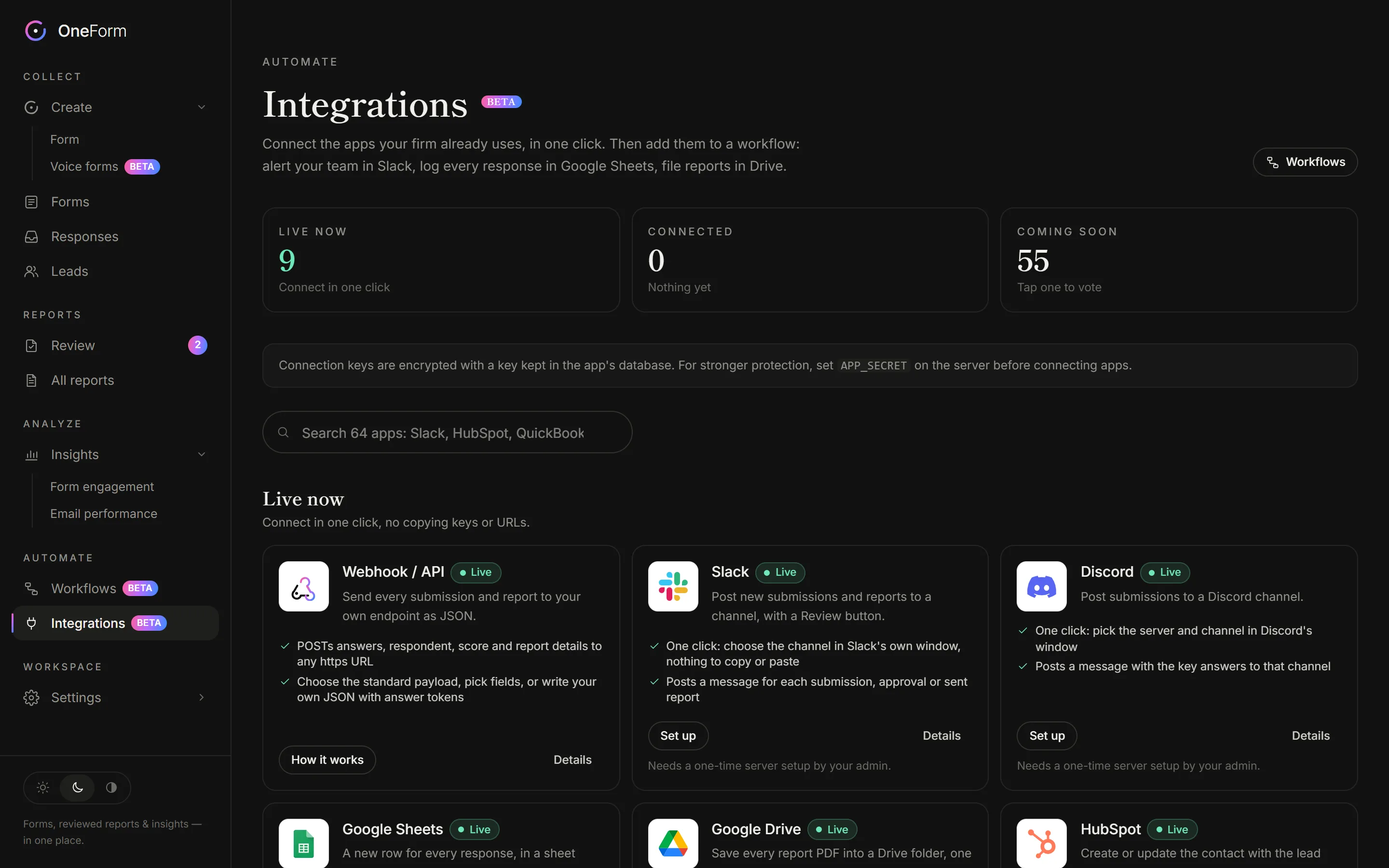
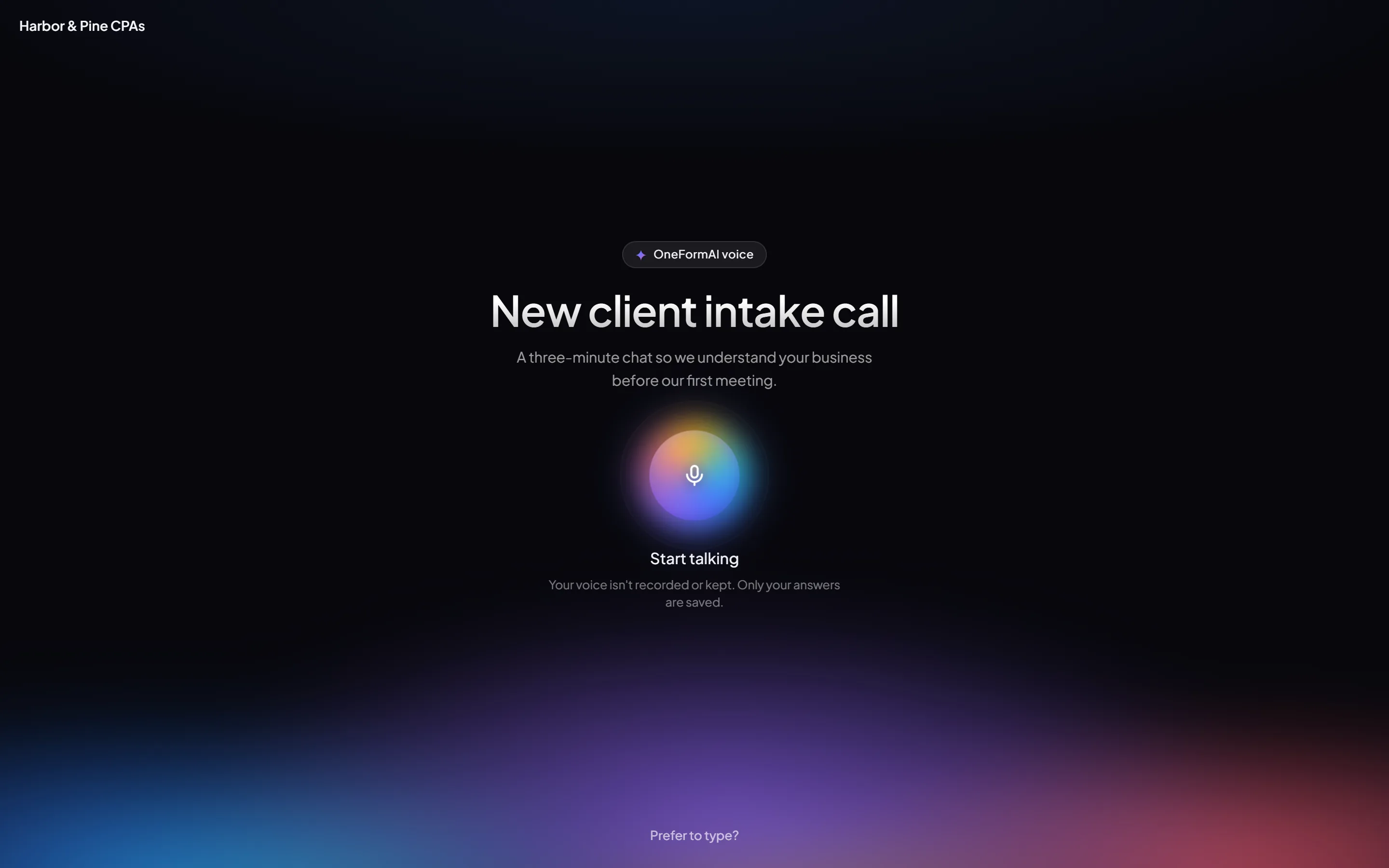
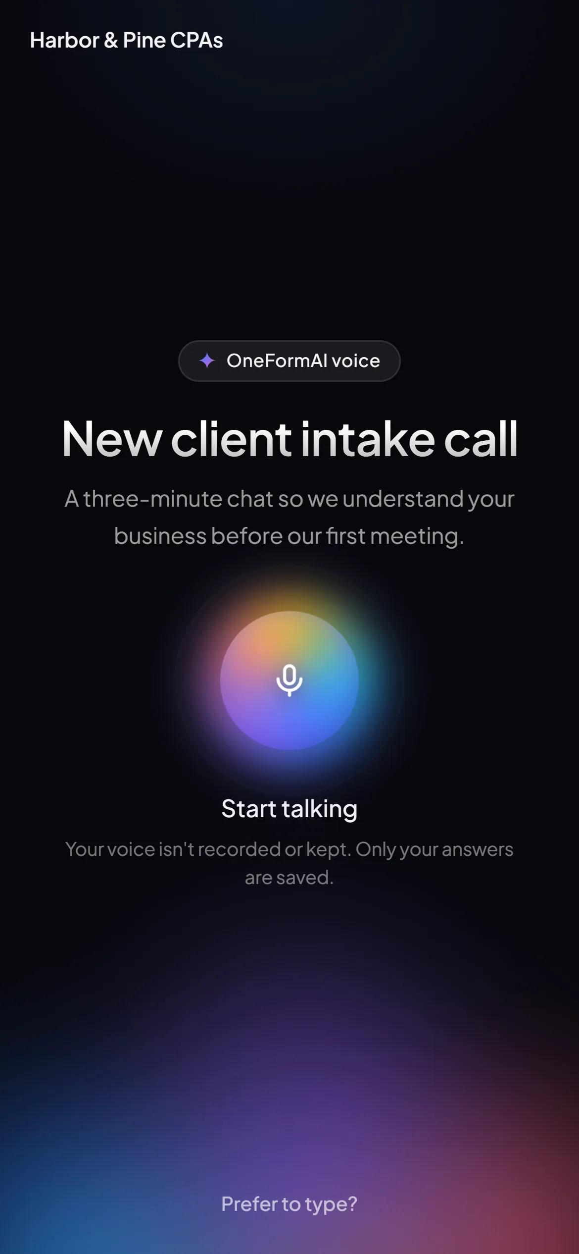
Real screens from the app at full resolution (WebP). Please don't edit what they show.
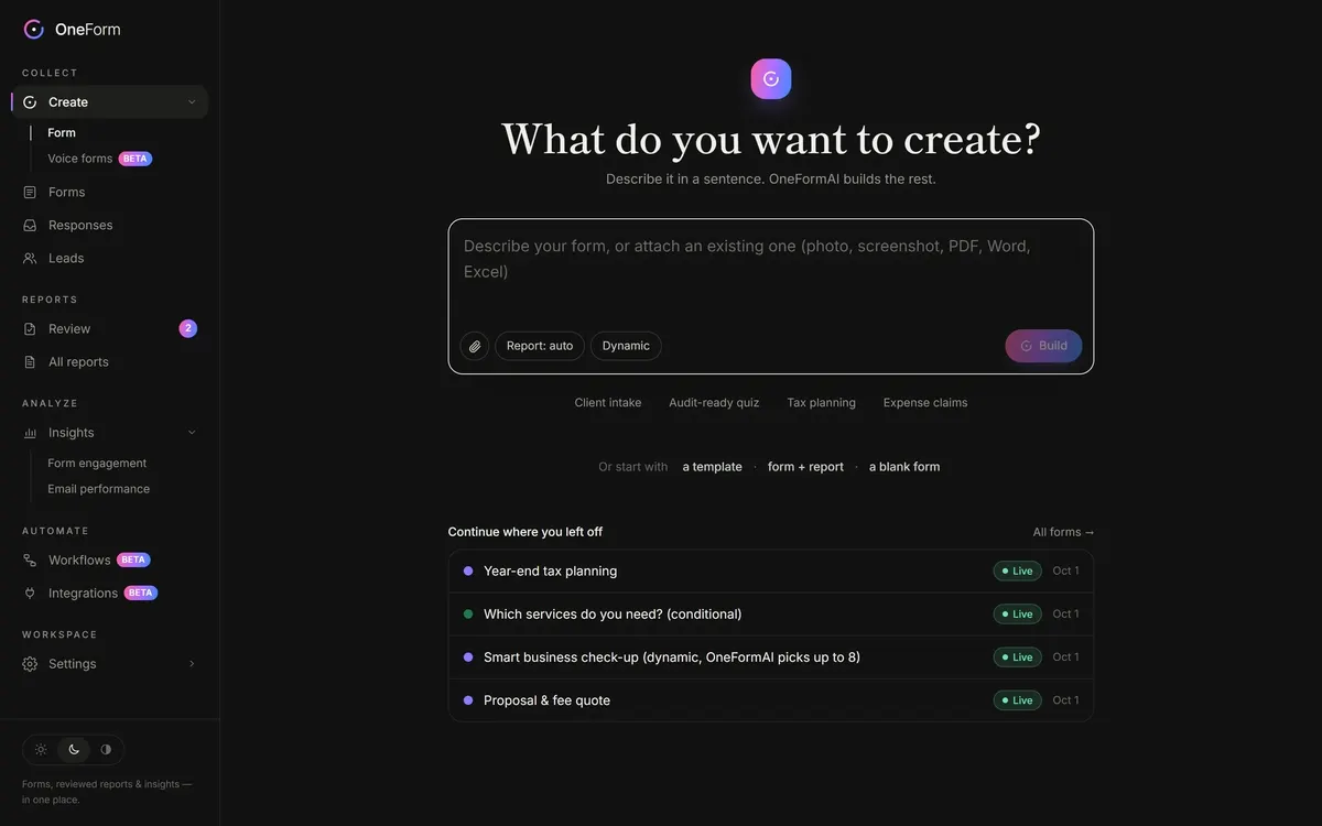 Create with AIWebP · 2880 × 1800
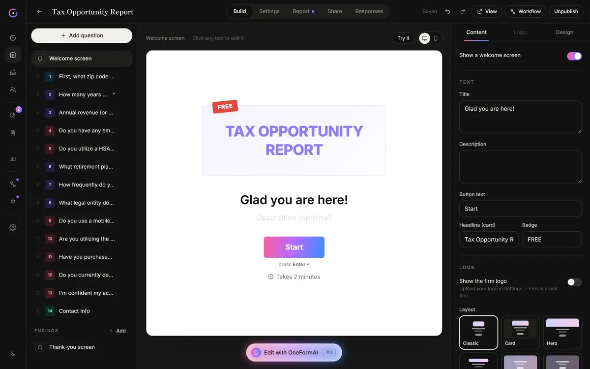 Form builderWebP · 2880 × 1800
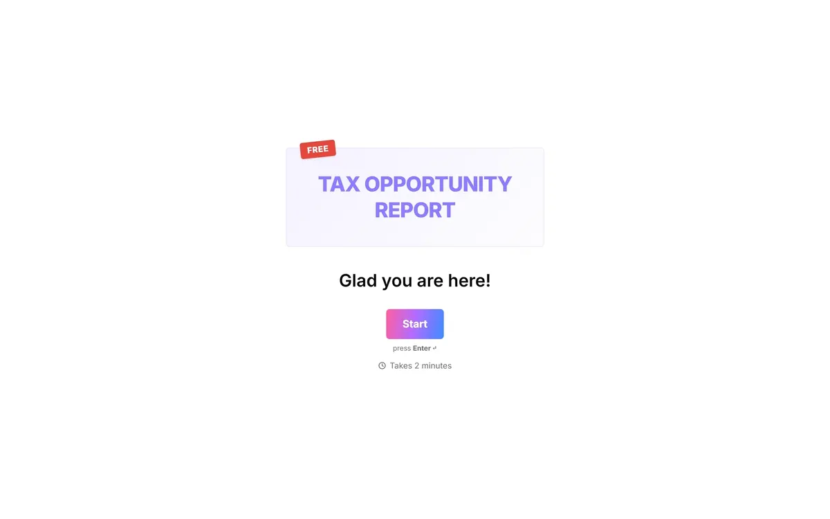 A client's formWebP · 2880 × 1800
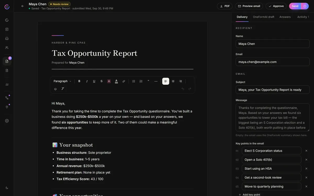 Report reviewWebP · 2880 × 1800
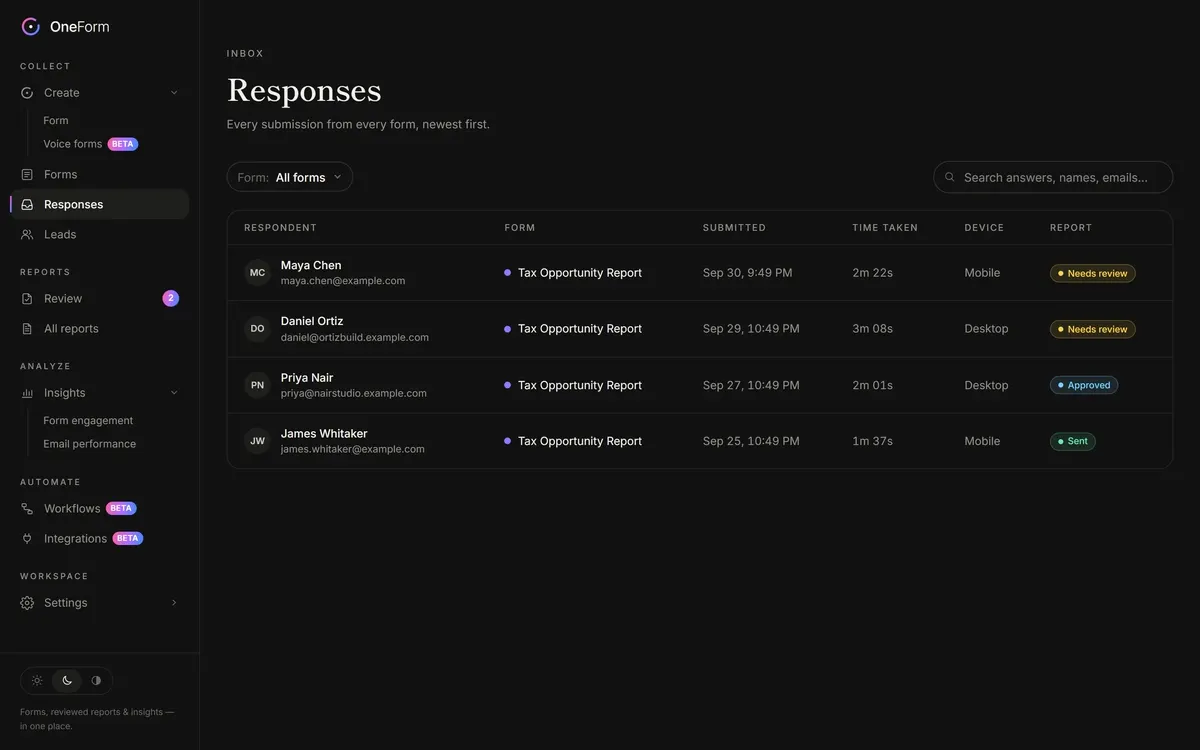 ResponsesWebP · 2880 × 1800
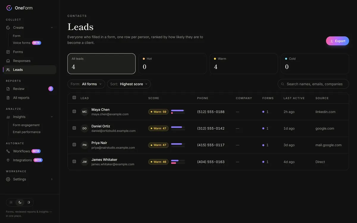 LeadsWebP · 2880 × 1800
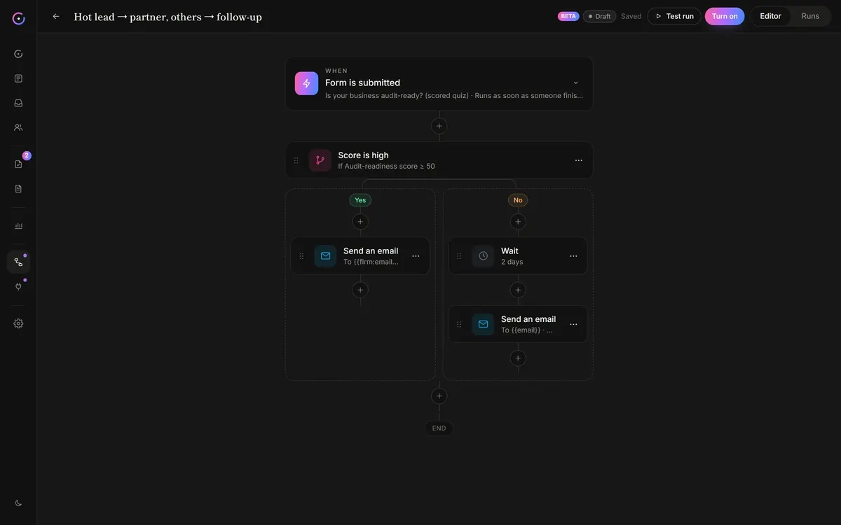 WorkflowsWebP · 2880 × 1800
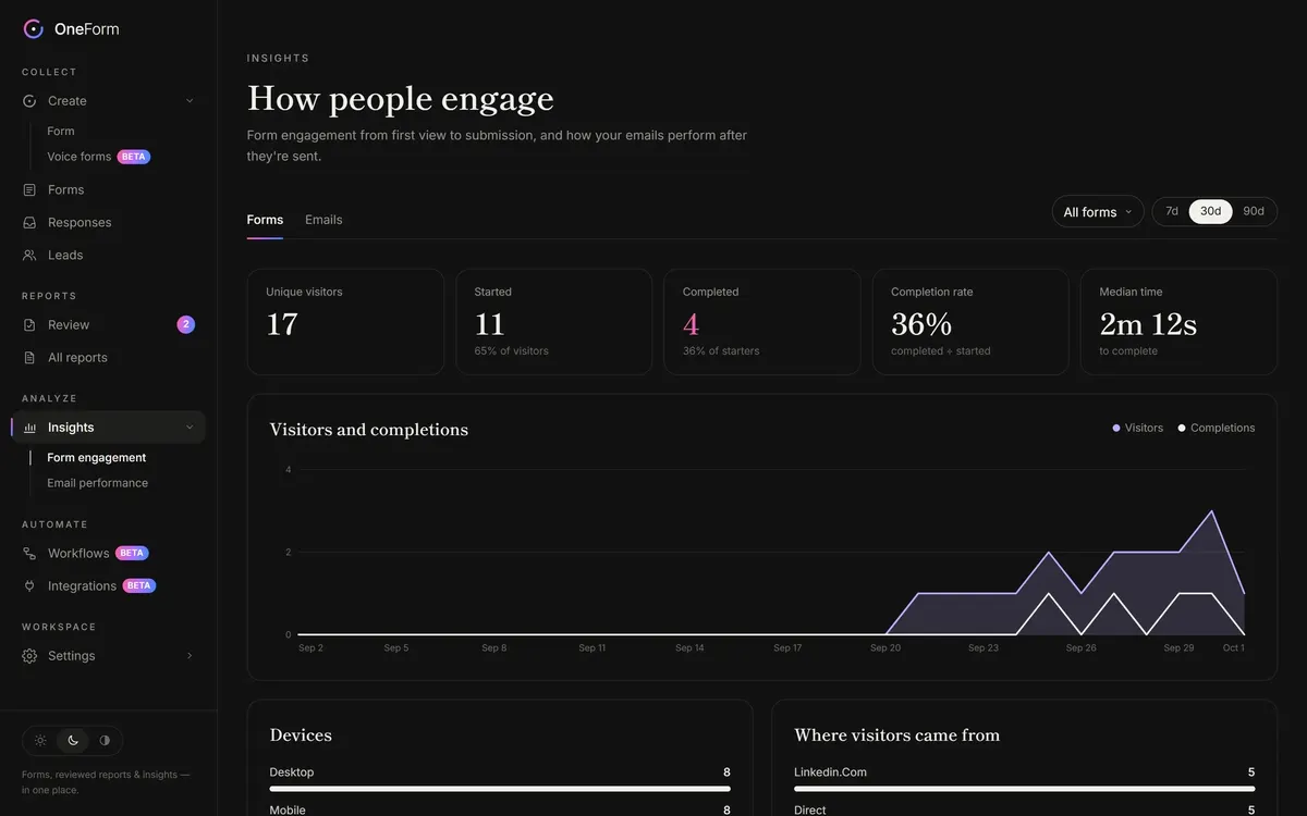 InsightsWebP · 2880 × 1800
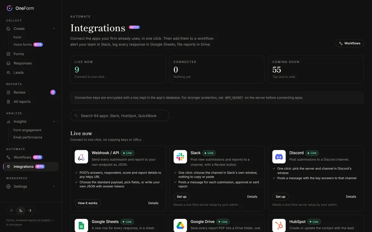 IntegrationsWebP · 2880 × 1800
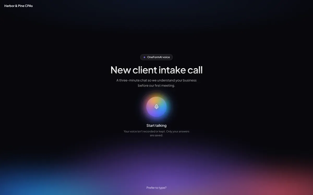 Voice forms (beta)WebP · 2880 × 1800
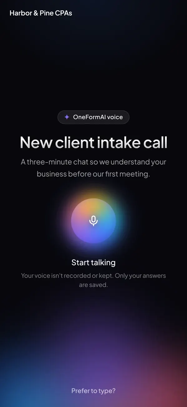 Voice forms on a phone (beta)WebP · 1170 × 2532
Made with OneForm.
The small badge OneForm shows on the forms and pages a firm's clients see. Here as files, in its light and dark versions.
 On light pages
<a href="https://oneform.si/"><img src="https://oneform.si/brand/badge/made-with-oneform-light.svg" alt="Made with OneForm" width="138" height="22"></a> On dark pages
<a href="https://oneform.si/"><img src="https://oneform.si/brand/badge/made-with-oneform-dark.svg" alt="Made with OneForm" width="138" height="22"></a>
Questions about the brand?
Writing about OneForm, or need a file that isn't here? Ask us.